
Overview and Assignment Summary
Data Visualisation is a project which connects science, design and art and it’s important to find a balance between the three. This brief has been left open allowing everyone to explore their interests and have the freedom to present something interesting and new at the final presentation.
During this project we are expected to explore with data visualisation and to experiment with code, illustrator and video.
Launch
Books and Artist References with great examples of Data Visualisation.


Nathan Yau – “One of the best ways to explore and try to understand a large dataset is with visualisation.”
“You can find out a lot about data just by visualising it, and a lot of the time this is all you need to make an informed decision or to tell a story.”
From Nathan Yau’s example of unemployment in United States over a period of 5 years I can see that comparison and colour are really important. Colour gradients are a great way to portray information and a simple ‘key’ can be a very effective and simple way to explain complex and/or large amounts of data in a minimalistic and artistic way. Yau also puts emphasis on the fact that data is available to us for free, there is a lot of information just waiting to be creatively visualised by people like us; artists and designers.


Workshop 01
Using Mackaroo to create fake data CSV files


Code describing how to read in a cvs file and refer to a table, use println(); to makes sure the file has been read properly


map function – reminder and definition


We learned how to export the processing sketch as a single frame pdf which exports the data as a vector meaning the sketch visuals can than be printed and fixed in illustrator.

lerpColor example

Sketchbook notes and illustrations from Monday and Tuesday.


mention Spotify Wrapped


I am currently trying to get my Spotify data information. I think this could be a very interesting database to explore especially since the popular ‘Spotify wrapped’ statistics which were individually published for everyone in December with clear personalised data visualisation.


Friday Seminar
This Seminar will be looking at artists and designers who use data in their work. Also how is this data gathered and presented.
http://www.dear-data.com/theproject
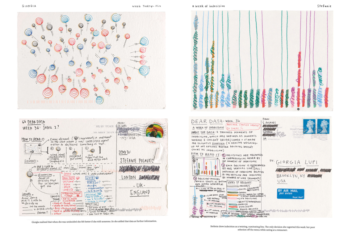
A Year long project by Giorgia Lupi and Stefanie Posavec.

Fernanda Viegas and Martin Wattenberg created a project which aimed to visualise wind in the US.
http://susanmorris.com/sundial-images/

Tapestry Work by Susan Morris representing a years data gathered by a watch.

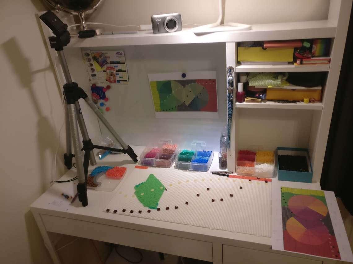
These works gave me an idea of re-creating my final data visualisation in an unusual way with unconventional materials. I am considering whether Hama beads could be a possible material.
Sketchbook notes and drawings made during Catherine’s seminar.


Monday Morning Session
‘The Happy Film’ by Stefan Sagmeister

I think today’s Monday Morning session was very relevant to Data Visualisation as Stefan Sagmeister has some references to data visualisation in his film.
Physical Outputs Workshop


In today’s Physical Outputs workshop we learned how to connect sensor’s to an Arduino in order to produce .csv data files which can then be linked to processing for interesting visual outputs as well as connecting to physical outputs such as lights and motors.
datasets:
Possible Ideas
Statistics about recycling in the UK: https://assets.publishing.service.gov.uk/government/uploads/system/uploads/attachment_data/file/784263/UK_Statistics_on_Waste_statistical_notice_March_2019_rev_FINAL.pdf
possible adaptation with fruit
Workshop 03 with Paul
Calculating circle area to portray data correctly.


A case key pressed sketch 1 = small airports, 2 = medium airports, 3 = large airports, 4 = heliport


Thursday - Idea exploration
Andreas Refsgaard has used Hama beads as his material in the project ‘PerlerBeads2Landscapes’ as a way for AI to create a realistic image based on the landscape shown out of the plastic beads. For my project I would like to use Hama beads as a possible outcome with already existing data.
experimenting with code:


I am currently trying to portray each country’s recycling percentage by implementing code from Paul’s workshop and adding a .csv dataset I have previously edited.
https://datacatalog.worldbank.org/dataset/what-waste-global-database
https://data.gov.uk/dataset/882186e7-97b0-4ad0-b253-e28607252f42/uk-statistics-on-waste
Plan / Tutorial


Workshop 04 with Paul
using the arc(); function, radians and PI


Loading a .json file and representing it with the arc PIE function

Experimenting with code

In this sketch I am trying to visualise the recycled amount of plastic in the UK between the years 2012 to 2017 (measured in thousands of tonnes)


I used a pie chart generator to get an idea of how the information between the UK and Poland compares.
UK Waste

Poland Waste


Click to access World%20Recycling%20League%20-%20Full%20Report%20-%20FINAL.pdf

source: https://data.oecd.org/waste/municipal-waste.htm
Early stages of mapping recycling rates, this sketch will be reformatted for my presentation sketchbook/booklet and it will have to be remapped for the bead illustration


On Photoshop I am working on creating a grid layout which I can follow when creating the final beads illustration. I created the grid template in processing.


https://spark.adobe.com/express-apps/chart/


I have finally created an accurate template containing all my data:
1.The black and white rectangles represent the percentage of recycled waste from years 1999 to 2017, black rectangles represent Poland and white rectangles represent the UK. The source for this data is :https://datacatalog.worldbank.org/dataset/what-waste-global-database . The Y axis ranges from 0% to 28% in the final scaled example and the X axis represent the 19 years ranging from 1999 to 2017.
2.The 2nd layer is of two pie charts which represent the composition of waste materials for Poland on the left and the UK on the right. I will insert two pictures portraying the exact data as I feel the final will be a little more abstract as I will be using a pixel art approach to represent the circles. I will provide a booklet/sketchbook with the accurate data so I don’t feel this should be a big issue or concern.


3.The third layer is representative of the amount of municipal waste produced in Poland and the UK. going down the X-axis represents years 1999 through to 2017, one year is represented by 3 bead rows down. The X axis represents the thousands of tonnes of musical waste produced and one bead represents a thousand (the values are rounded to the nearest thousand). The left is Poland and the right is the UK.
4.The final background layer represents the population of the two countries, Poland on the left and the UK on the right.
I’ve been working on some code for my sketchbook/booklet, which I hope to complete for Friday presentations, and managed to get a very basic representation of the musical waste produced annually by Poland vs the UK. It took me a while to flip the UK data so that it was mapped opposing Poland’s data but I finally understand the code and the numbers.


I still have a bit of work to do so the representation and scale is more accurate but I’m happy that the csv files are working correctly and the format template is complete. While working with the numbers I stumbled upon a mistake I appreciated aesthetically which means I might use it in the booklet.

Sketchbook pages made during this project. These pages show different maths calculations and data diagrams as well as sketches and also plans for different outcomes like the booklet labelled and annotated. My sketchbook also explores ideas and inspirations.


Progress Pictures


Reflection
Overall, I feel like I took a lot of risks during this project and pushed myself out of my comfort zone. I experimented with video by creating my time-lapse taking over 10 hours of footage and showing it over 5minutes. This was extremely challenging as I don’t often work with video but it allowed me to get more familiar with my camera and it’s settings. I also enjoyed my unusual choice of material as it was a playful approach and technique however this also provided it’s challenges clearly visible with my ironing mistake, but I don’t regret this as it really pushed me to find new ways of representing things like sketches produced on my computer in a physical space and environment. I also pushed myself by creating 3 interlinked finals which was very time consuming and I put a lot of work into making everything. I enjoy how the piece can be viewed as abstract on it’s own but once viewed with the booklet it becomes obvious there is a key to what appears to be very random and chaotic.
